ShmoopTube
Where Monty Python meets your 10th grade teacher.
Search Thousands of Shmoop Videos
AP U.S. History 4.3 Period 1: 1491-1607 7 Views
Share It!
Description:
AP U.S. History 4.3 Period 1: 1491-1607. The pattern depicted on the graph from 1650 to 1850 best served as evidence of what?
Transcript
- 00:00
Thank you We sneak then here's your shmoop du jour
- 00:05
brought to you by the new world on the old
- 00:07
one was getting pretty shabby Anyway i take a look
- 00:10
at the chart right here singhania and here's Our question
- 00:13
The pattern depicted on the graph from sixteen fifty two
Full Transcript
- 00:15
eighteen fifty best serves as evidence of what other than
- 00:20
low budgets chart making And here your potential answers Yeah
- 00:23
decimation Okay so the redline representing the european population in
- 00:30
america shoots up sharply while the blue line representing the
- 00:33
population in the new world flat lines for a bit
- 00:36
then starts creeping on up there So one of these
- 00:38
lines mean Well one thing the graf didn't tell us
- 00:41
is that the native population of north america was crushed
- 00:46
The graft doesn't show any large dips which we would
- 00:49
see if this graph was showing us a population decrease
- 00:53
However the lines are both increasing so we know that
- 00:56
we're looking at a population increased This means we can
- 00:59
go ahead and cross out a way we can also
- 01:01
eliminate See population growth with in american colonies does flatline
- 01:05
for a bit But then it starts to rise though
- 01:07
saying that it was stagnant or lacking movement would contradict
- 01:10
the graph And this graph has an attitude so you
- 01:13
wouldn't want to contradict it All right Last on the
- 01:15
chopping block d sure the atlantic slave trade may have
- 01:19
influenced population of the old and new world but not
- 01:22
enough to influence the charts Pattern There's better answer here
- 01:25
So he's gotta go That means our better and correct
- 01:27
answer Is b the spike in european population scene in
- 01:30
the chart is the direct result of the introduction of
- 01:32
new world products and industry the natural resources of the
- 01:36
new world We're like a pair of jumper cables that
- 01:38
revved up the engine of the old world Sometimes europe
- 01:41
had a tough time feeding itself and new world crops
- 01:43
like potatoes and maize field a major european baby boom
- 01:47
by ensuring that people stayed healthy and well nourished long
- 01:50
enough to procreate As for europe having a tough time
- 01:54
feeding itself well maybe someone should try the airplane thing
- 01:56
You know make the spoon and their plane you know 00:02:01.45 --> [endTime] works every time on our kid
Up Next
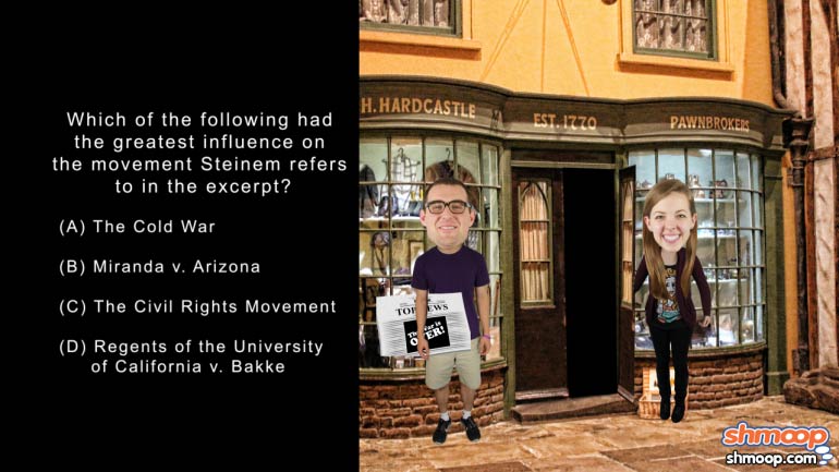
AP U.S. History Exam 2.48. Which of the following had the greatest influence on the movement Steinem refers to in the excerpt?
Related Videos
The appeal of city living has always been strong. Can you figure out why new immigrants chose to live in big cities? Hint: they weren't trying to b...
AP U.S. History Exam 2.54. Given the excerpt, many critics of the war on terrorism believed that...what?
AP U.S. History Exam 2.43. The problem depicted in the image led to the creation of...what?
Take a look at this sweet question about Equal rights. ...Oh. It's not about the sweetener? Gotcha. Check it out anyway and see if you can find out...


